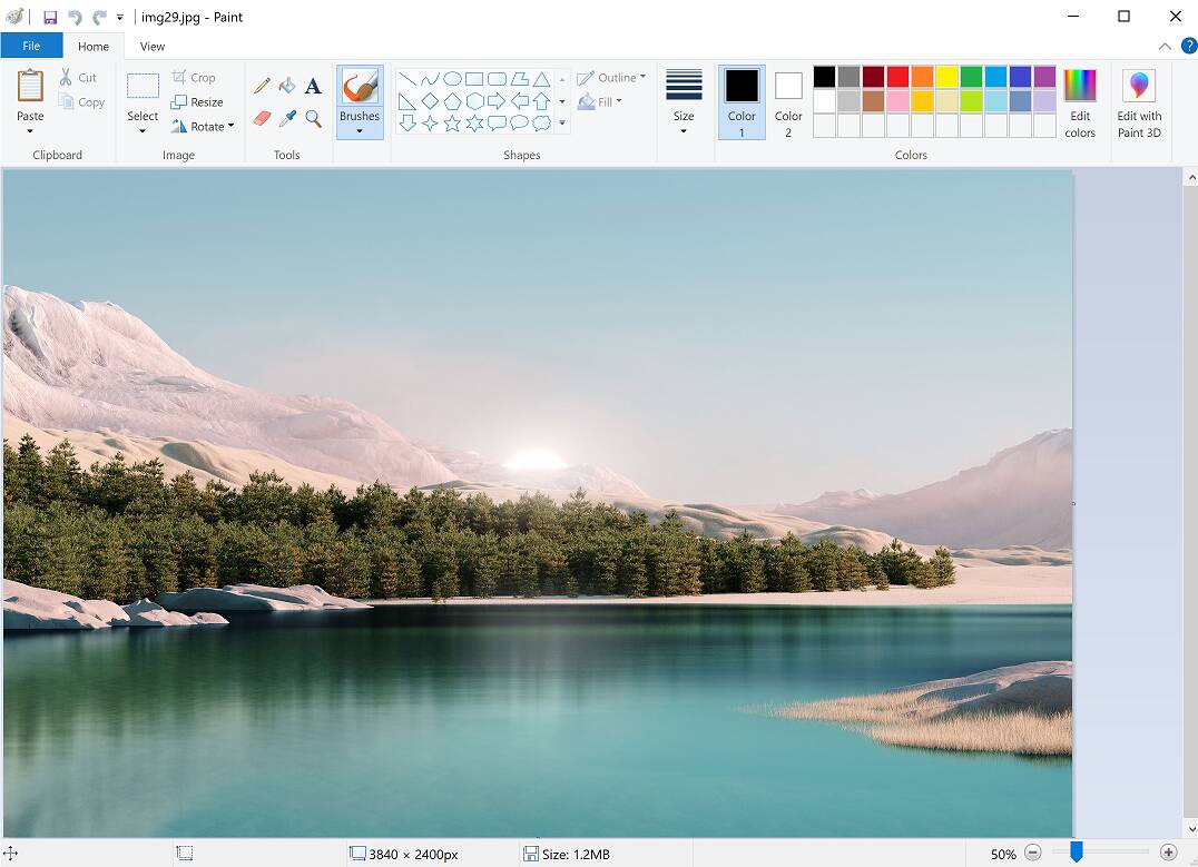
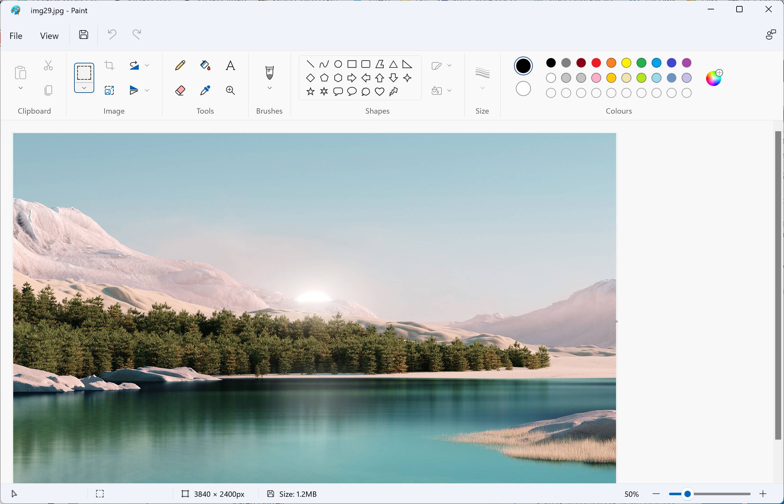
What has changed? Functionally, the two versions seem identical.
Here are some of the changes in detail
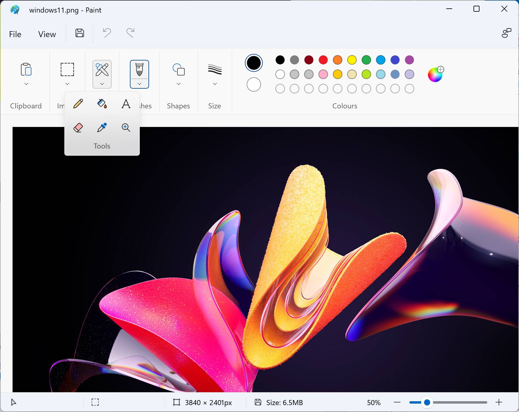
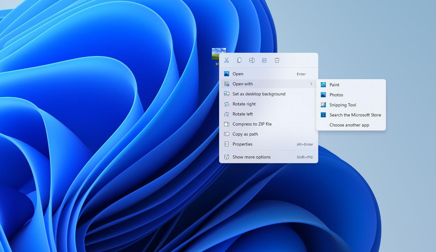
Almost all the icons have been replaced. Microsoft has written about Windows 11 iconography
here.
There are new fonts in Windows 11, including Segoe Fluent Icons. "This new font compliments Windows 11's geometry," the docs say. "Geometry" means the shape, size and position of UI elements, with Windows 11 featuring "progressively rounded corners, nested elements, and consistent gutters."
The new iconography is intended to be minimalist, based on "simple and geometric forms," and using "modern metaphors that are easily understood."
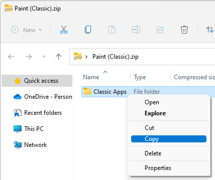
Anyone who has puzzled over diagrammatic instructions when trying to use or assemble a new device will know that what is obvious to the designer may not be obvious to the user. The icon for Flip vertical looks like a paper aeroplane, for example. The new copy icon is so minimalist that it is, to our eyes, less obvious than the old "two sheets of paper" design; but these things are subjective and become familiar.
It is notable, though, that the designers have removed text. The ribbon in Windows 10 Paint has 20 words (not including "Edit with Paint 3D, which has been removed) when fully expanded, whereas Windows 11 Paint has just 7. There are tooltips, but these too are more minimal. For example, old Paint has a tooltip that states "Resize and skew the picture or selection" and also shows the keyboard shortcut. The same tooltip in new Paint just says "Resize". The Skew option is not discovered until you click.
Pitääkö tässä siirtyä Linuxin käyttöön kun valvontaa vaan lisätään prkl.

